
Small Balcony Decor Ideas That Look Expensive
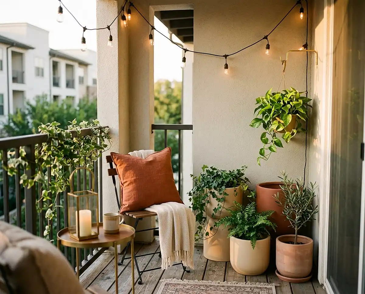
Small balcony decor ideas that look expensive almost always come down to color, not price. A tight, intentional palette turns a 5×8-foot slab of concrete into something that reads like a design magazine spread.
I learned this the hard way on my own west-facing balcony in Denver, zone 6a. My first year, I bought whatever pot was on sale — terracotta here, a blue glazed ceramic there, a leftover black plastic nursery pot I never repotted.
It looked like a garden center clearance aisle, not a small balcony garden I wanted to sit on.
Table of Contents
Why Color Choices Make Small Balcony Decor Ideas Look Expensive
Furniture and plant count get all the attention, but color discipline is what actually reads as “expensive” to the eye. A small space with five colors fighting for attention looks cluttered no matter how nice each individual piece is.
Limit the palette and the same budget furniture suddenly looks curated. When I swapped my mismatched pots for a single tonal family, I didn’t spend more — I just stopped buying whatever caught my eye that week.
This is the core idea behind every balcony color palette that reads as high-end: restraint, not spend.
The Design Principle Behind Expensive-Looking Small Spaces
The Rule of Three Colors
Quick Answer: Stick to one neutral base, one accent color, and one greenery tone. That’s it — three colors, repeated across pots, textiles, and trim.
I use this on my own balcony: cream planters (base), brass hose clips and a rust-colored cushion (accent), and deep green foliage that does the rest of the work. Nothing else gets added without checking against those three.
Pro Tip: Pick your accent color from something you already own, like a cushion or lantern, so you’re not shopping for a fourth color by accident.
Monochromatic and Tonal Palettes for a Curated Feel
Quick Answer: A monochromatic palette uses several shades of one color family — light terracotta, mid rust, deep clay — instead of one flat tone. It creates depth without adding visual noise.
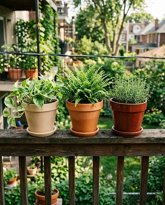
Last spring I lined three terracotta shades along my railing: a pale sand pot, a classic terracotta, and one glazed in deep rust. From four feet away it reads as one cohesive collection, not three random purchases.
Best Color Palettes for Small Balconies
Neutral and Earthy Tones (Beige, Terracotta, Cream)
Quick Answer: Beige, terracotta, and cream planters paired with green foliage give a timeless, high-end look that never feels trendy or dated.
Matte ceramic or natural clay planters complement this palette best — glossy plastic breaks the illusion. I’ve had good luck with unglazed terracotta from a local pottery supplier; it ages into an even nicer patina by year two.
Black, White, and Greenery Contrast
Quick Answer: A black-and-white base with green plants as the only color creates a modern, minimalist look where the plants become the focal point.

I tried this on a friend’s north-facing balcony in Chicago using matte black metal planters against white string lights. The green pothos and ferns did all the visual work, and the space photographed better than my own tonal terracotta setup.
Sage, Olive, and Muted Green Tones
Quick Answer: Sage and olive-toned planters echo the plants themselves, creating a botanical, spa-like feel that never clashes with foliage.
This palette is forgiving if you’re still building your apartment gardening plant collection, since almost any green plant fits without a color audit.
Warm Terracotta and Rust with Brass Accents
Quick Answer: Warm clay tones paired with brass or aged-gold hardware create a Mediterranean, high-end aesthetic that photographs beautifully at golden hour.
I added a small brass watering can and copper plant tags to my terracotta setup two summers ago. It’s the single cheapest change I’ve made that got the most compliments from neighbors.
Choosing Planters and Materials That Elevate the Palette
Planter material affects perceived cost more than the plants themselves. A glossy plastic pot in a “correct” color still reads as cheap, while matte ceramic, concrete, or natural rattan in an off-tone still looks intentional.
- Matte ceramic: best for neutral and monochromatic palettes, holds color evenly in direct sun
- Concrete or fiber-clay: pairs well with black-and-white minimalist schemes, very weather-tough
- Natural rattan or seagrass: complements sage and olive palettes, but needs a plastic liner in wet climates
- Unglazed terracotta: ideal for warm earthy and Mediterranean palettes, ages beautifully
Match the finish to the mood you want: matte reads calmer and more expensive, gloss reads younger and more casual.
Selecting Plants That Reinforce Your Color Scheme
Plants aren’t just filler — they’re part of the palette. Choose foliage color deliberately instead of grabbing whatever’s blooming at the garden center.
| Palette | Reinforcing Plant | Why It Works |
|---|---|---|
| Neutral/cream | Dusty miller | Silvery foliage echoes the base tone |
| Black and white | Variegated pothos | High contrast keeps the minimalist feel |
| Sage and olive | Rosemary or lavender | Muted green-gray matches the tonal family |
| Terracotta and rust | Dark-leaved coleus | Deep burgundy complements warm clay tones |
On my own balcony, dusty miller against cream ceramic pots is the single most-asked-about combination I’ve grown. It’s inexpensive, hardy through a Denver summer, and does exactly what the palette needs.
Materials and Tools Checklist for a Cohesive Balcony Makeover
- Matching planter set (3-5 pots in the same material and finish)
- Outdoor-rated spray paint or primer for repainting mismatched pots
- Coordinating textiles: one cushion fabric, one rug tone
- Plants chosen specifically for foliage or bloom color, not just species
- Drainage trays in a matching or neutral tone, not clear plastic
I keep this list taped inside my storage bin so I don’t impulse-buy a mismatched pot every spring.
Step-by-Step: Applying Your Color Palette to the Balcony
Step 1: Choose Your Base, Accent, and Greenery Tones
Pick your three colors before buying a single planter or cushion. I sketch mine on a sticky note and keep it on my phone while shopping so I don’t drift.
Step 2: Repaint or Replace Mismatched Planters
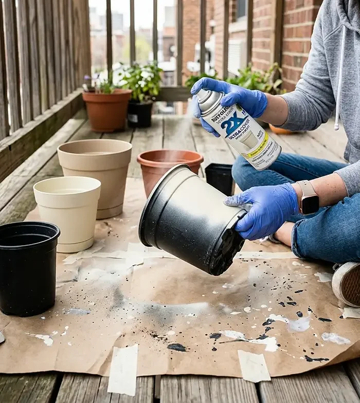
Outdoor spray paint unifies old pots without buying anything new. I repainted four leftover plastic pots with matte cream spray paint in one afternoon for under $20.
Step 3: Layer Textiles and Accessories to Reinforce the Palette
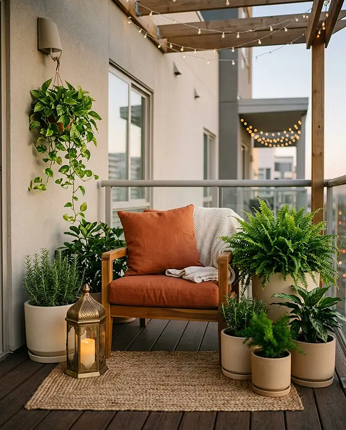
Add a cushion, small rug, or lantern in one of your three tones to finish the look. This is the step people skip, and it’s the one that makes the space feel like a room instead of a plant shelf.
Seasonal Adjustments to Keep the Palette Fresh
Rotating Seasonal Flowers Within Your Color Scheme
Swap bloom colors by season while staying inside your palette. I rotate cream ranunculus in spring for rust-toned mums in fall, keeping the same three-color frame year-round.
Winter Palette Maintenance with Evergreens and Neutral Textures
When flowers fade, evergreens and neutral textures hold the aesthetic. I lean on rosemary and a folded wool throw in my accent color to carry the balcony through a Denver winter.
Regional Considerations for Plant and Material Choices
Climate zone determines which plants can hold your palette outdoors year-round versus needing seasonal rotation. Check your USDA hardiness zone before committing to evergreens for a winter palette.
In zone 6a, rosemary needs winter protection or container movement indoors. In zone 8 and warmer, it can stay outside year-round as a permanent greenery anchor for the palette.
Common Problems and Solutions
Balcony Feels Cluttered Despite Coordinated Colors
Too many small items breaks cohesion even within a correct palette. Consolidate into fewer, larger statement pieces instead of five small pots in the same colors.
Planters Fading or Discoloring in Sun Exposure
UV exposure fades painted and plastic planters within a season or two. Use UV-resistant outdoor paint, or place vulnerable pots in a partially shaded corner of the balcony.
Plant Colors Clashing with Chosen Palette
Audit your plants twice a season and swap out any variety whose bloom or foliage disrupts the palette. I moved a hot-pink geranium off my terracotta balcony last summer for exactly this reason — it fought with everything else.
small balcony decor ideas that look expensive FAQs
What color planters make a balcony look expensive?
Matte neutral tones like charcoal, cream, or terracotta are the top expensive-looking choices. They pair easily with greenery and avoid the glossy, mismatched look that makes small spaces feel cheap.
How many colors should I use in a small balcony design?
Limit your palette to two to three core colors: one neutral base, one accent, and one greenery tone. This keeps a small balcony garden looking cohesive and upscale instead of cluttered.
Can I repaint plastic planters to match my color scheme?
Yes. Use an outdoor-rated, UV-resistant spray paint made for plastic surfaces for a durable finish. Clean and lightly sand the pot first so the paint adheres evenly.
What plants naturally fit a neutral or monochromatic balcony palette?
Silver-toned dusty miller, deep burgundy coleus, and solid green foliage plants like pothos or ferns are versatile options. They reinforce almost any neutral or tonal palette without clashing.
Key Takeaways
- Small balcony decor ideas that look expensive rely on a tight three-color rule, not a bigger budget
- Match planter material and finish to your palette — matte ceramic and unglazed terracotta read more expensive than gloss or plastic
- Choose plants for foliage or bloom color, not just species, to reinforce the scheme
- Check your USDA zone before building a winter palette around evergreens
- For more renter-friendly patio garden ideas, focus on paint and textiles you can take with you when you move